Notions-Drye Goods Studio Diary

Thanks for checking in. I am a fiber artist. My current emphasis is on eco printing and other wildcraft with a touch of up-cycling thrown in. You can also catch up with me on Facebook at Drye Goods Studio.
Showing posts with label colors. Show all posts

Saturday, February 11, 2023

A Spot of Tea

"There is something about the nature of tea that leads us into a world of quiet contemplation of life."

Lin Yutang, The Importance of Living 


I am participating in an exhibition in May that is all about tea. Today I started the process to dye fabrics for this piece having no idea what the final project will look like. I am generally inspired by materials, so I figured the way to get started, was, well, make the materials for the piece! The first thing to decide was should the work just involve only traditional black tea. Depending on the strength of the tea, how long you expose the fabric, or what mordants/adjuncts are used, the possibilities are probably endless. People make tea out of many different leaves and flowers not only for enjoyment, but medicinal use as well. I decided to look through my tea cabinet to see what the other options might be.

In the event I want to use other colors besides "just tea" I gathered up bagged and loose teas that are also used in natural dyeing. After some research I decided to let them steep overnight to enhance (hopefully) the intensity of the colors. From left to right: Chamomile, St John's Wort, Comfrey, Hibiscus, Nettle.  I am only going to be dyeing fat quarter size pieces of silk broadcloth, so this should be plenty.

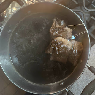
I also brewed up a medium size stock pot of plain old, very strong, black tea. This first go around I will be using a half yard of silk broadcloth treated with alum. I may do some sort of resists, various adjuncts, and vary the exposure time to get multiple tones. I have another untreated half yard reserved for other possibilities. 


Saturday, October 23, 2021

Gray Fall Days

 "The color of truth is gray."

Andre Gide


I went walking the other day before the rain got going, to look for sticks for a project. I love this old tree, it is down near the river bank. At some point it split in two and both halves, the one still vertical as well as that laying on the ground continued to grow. The one on the ground seems to have finally given in. Sad as that is, I am always intrigued with the weathering of the exposed wood. 

Sunday, March 14, 2021

ORANGE! (In a good way!)

 A few weeks ago I posted the start of an experiment with padauk sawdust my husband gave me-and here is the result!

The top is an overdye of an eco printed piece of silk crepe that I had done a "re-mordant" (is that a thing?) with alum; the next one down is silk twill that had a faint yellow dye on it (my guess would be tansy flower dye) to start with and thus some alum; the redish one is an overdye of an eco print on crepe with no additional mordant, just straight into the dye pot with it, and the vivid one at the bottom is another piece of silk twill that had an alum mordant applied. 


This is eco printed paper, front and back of the same piece. I have taken to keeping the "so-so" paper prints in a stack off to the side for "spent" dye baths. This particular paper was printed with poinsettia so the paper had alum applied before printing. I tossed it into the warmish padauk dye when I was all done and promptly forgot about it. So, imagine my surprise when I hauled the dye pot out to the compost pile and the last thing to come out of the pot was this piece of paper! It had sat in the dye so long it had sunk to the bottom.

I have another batch of sawdust soaking in vodka for another round of samples. This time I want to fiddle with the ph of the dye bath to see if I can get more of a red. Stay tuned!

Monday, March 1, 2021

Seeing Red

 "If I could tell you about Red

I would sing to you of fire

Sweet like cherries

Burning like cinnamon

Smelling like a rose in the sun"

Dixie Dawn Miller Goode, Rainbows Around Us: A Celebration of Color


I started an experiment with Padauk saw dust my husband saved for me. After some digging around on the internet, I did find several sets of instructions, but not much on how permanent the final color will be. So we'll just have to see what happens.

Here is the sawdust.

This is the type of pigment that has to be soaked out in alcohol, so here is about a cup of sawdust soaking in about two cups of vodka. It was such a beautiful day today I had to run the jar outside to give you the full effect. Most instructions said to let it set for a week or more, so I will be getting some small pieces of silk ready to dye later this week.

Padauk (pterocarpus) is the bright red strip in this cutting board my husband made. The tree is native to the African continent and is also called mukwa or narra.  

I will have several experiments going while waiting for the local leaves to appear. Somebody gave me some alkanet, which I think I left in the cabinet after I discovered that it will pretty much fade with exposure to air, much more so with sun etc. But, impermanence being the way of all things I decided that it would be fun to play with, I have some older scarves of my own that might like to be purple! When and if they fade, maybe they will want to be some other color at that point. I also have a bag of avocado pits going in the freezer, I am never sure how many it takes, but I have some paper and lace just waiting to that lovely shade of pink avocado pits can produce.

Friday, January 1, 2021

New Year, New Day

 "Living in the past is depression, living in the future is anxiety."

Unknown


We have hit the gray and sometimes bleak part of winter here, so I decided to spend the week making a little sunshine. In the summer I pick Tansy flowers from along the river and hang them to dry for just such an occasion.

I put the dried flower heads in a pot of water to soak overnight, then simmered them for about 45 minutes to make the dye. The scent is lovely, like yarrow, sharp and calming at the same time.

This is right at the beginning, such a beautiful soft color! I simmered them for about an hour and then let them sit until evening before removing them from the dye bath.


The fabric in the background silk crepe de chine, the one swooshing across the middle is silk dupioni. These were scrappy type pieces of fabric that I had treated with alum last summer (I have no idea what I intended to do with them then) and they did have a bit of iron contamination as there are some spots here and there. No worries, I will either find something to do with them, or maybe, give them a bath in the iron pot and turn them olive green at a later date. Right now they are hanging in my studio so I can enjoy the color, which is about the color of the winter sun here when we get to see it.

At the moment, I am doing my best to live in the moment. Having too many expectations for the coming year could make it seem worse than it actually is. Looking back on the debacle of 2020, I can see where I did that to myself at times. I was just reading an article about people who are starting up whole new businesses during the pandemic, and I know several personally that started up businesses during the Great Recession that are still in business. While I have no interest in reinventing the wheel at this point, I am looking deeply (as I was right before the pandemic started) into the business side of my art, while still practicing art, no matter what type it is. I bought myself a little Christmas present, Shelley Rhodes book Sketchbook Explorations, and although I have never really kept sketchbooks decided it would be an interesting idea to mess around with while waiting for the snow to melt and spring to return. Only two days into it and I have had a bunch of thoughts about the art, that may or may not lead to other business ideas. But without the art, there is no business, so the thing to do is keep making more art and when the time is right (whenever in the world that might end up being) the business ideas tend to synthesize themselves.

If you can't seem to get into the "Happy New Year" mood, that may actually be a good thing for now. It may be your soul protecting you from either overthinking the past or the future; and thus causing you pain of one sort or another. About the only thing you have control over is today, so the things to do today are those that make tomorrow a better place, no matter what happens. 

Cheers, take care of yourself and stay safe.

Tuesday, August 11, 2020

Experiments with Indigo


I grew indigo this year and decided it was time do something with it. I used the recipe that is in Harvesting Color by Rebecca Burgess.


I planted it in big pots this year, about 4 or 5 plants to each pot. Since it does require a fair amount of water it was much easier to maintain it this time around. This is Japanese Indigo (polygonum tinctorium).


This method calls for cramming a pound's worth of leaves into a large jar. It does not need to be quite this fancy, but this was the biggest one I had that was clean. Indigo requires no mordant and from what I have read can be come displeased with residues etc.


You then put the jar of leaves and water into a big pot of steaming water. You don't want it to boil, thus the thermometer. The water in the jar is turning dark in this picture, the water in the pot is clear water. I thought this was a great way to do this as it makes it much less likely that the indigo will get too hot. The only downside to it is that it doesn't make a ton of dye, but there is still enough left to do some other small pieces. Once I got to the point where I alkalized, oxygenated and then reduced the dye, there wasn't time to take any pictures. But that is ok, I highly recommend getting the book (link above) and following it step by step.


This was the end result! I was so pleased with it as I haven't done much indigo and at different times it didn't seem like the process was going the way she said it would in the book. This is silk crepe de chine and I am just going to admire it for awhile before making it into anything.

Remember you can get handmade supplies in my Etsy Shop and there are scarves available at The Pottery Place Plus online store.


Friday, February 22, 2019

Results of the Steamer Pot Picture

I posted this picture on Drye Goods Studio Facebook page the other day and it got some attention along with people asking to see results because of the foil liner. It functions as a barrier, but in a small way as a mordant blanket. I have done this before and have gotten zingier colors, but maybe that was because I was using fresh plant material, this was all done with dry leaves.


So here you go:

Vine Maple, the yellow is the "ghost" from the top of the leaf, the darker print is from the underside or veined side.


A side by side comparison of oak with and with foil barriers. The one on the left is without; the prints are a brown/plum and the background has more "noise" in it. The one on the right is a different shade of brown and the background is cleaner.

Acer Rubrum 

Dogwood
Not sure about the yellow and brown as a color combo, I may do something else with them while staring out the window watching the snow pile up.

Thursday, February 7, 2019

Winter Fun

Sometimes you just need to take something one step further, for whatever reason. Winter is a great time for eco printers to catch up on stuff like that. You may have things set aside that didn't turn out all that great, or are not what you expected. It could also be that while something is a perfectly acceptable piece of fabric, it isn't the color that you need at the moment.


I picked these two pieces to do over. The one on the left is silk charmeuse, and while a nice print, there isn't enough contrast between it and the other things I would like to go with it. The one on the right is an experiment with only the green leaves of Poinsettia. In this picture it looks a lot better than it does in real life. It came out very pale and then there are the hinky black spots.


You have some options; you could mix up some sort of dye and over dye the whole thing, or you could just eco print over what you already did-sometimes those turn out fantastic, or you can expose it to another mordant or adjunct. In this case I am using the iron pot as the post mordant or adjunct. I wanted the charmeuse piece to be darker, more gray and in the case of the yellow nightmare-anything has to be better than that, so into the iron pot they went. First I filled this cast iron dutch oven with water and a splash of vinegar and brought that to a boil and then hauled it back inside to cool off. I was afraid if I left out on the gas stove to cool I would forget it and it would freeze solid in this lovely polar vortex we are having. Once the water was tepid I dumped in both pieces of fabric. Then I went off to do something else, but I set the timer on my phone for about 15 minutes so I would remember to go back, give the fabric a stir and check to see what was happening. 

The first time around there wasn't much going on but as the afternoon progressed both pieces got darker. I was really hoping the yellow one would turn green as it sometimes does with this treatment, but as you will see in the pictures below, it came out kind of gray. There isn't an exact procedure for this process, when you think it is dark enough, take it out. Remember that wet fabric appears about two shades darker than when it is dry, so take that into consideration. Depending on the plant material, it is possible to turn something totally black, so if that isn't what you are after-check it often.

This is the one that was yellow. I like it and may leave it that way, but I could eco print on top of it. I may just let it sit around a bit to ponder if it is done or not.

This is the charmeuse piece, the background is grayed out and some of the leaf prints are more defined.
If you are wondering why I took the second set of pictures against a canvas background it is because I had a bear of a time getting the colors right in the photos. I let the phone update last night-and no Samsung, I am not at all happy with the updates to the camera!! It was very difficult to get true color, especially with the shiny charmeuse, so about the only way to get you to see what I see (and not have to troop out into the aforementioned polar vortex to take pictures) was to lay both pieces against the white, it must make the camera "see" differently or something. No amount of messing around with the settings would fix it. Anyway, the background came out a lovely blue-gray and will look great with the other two pieces of fabric I am using.

Thursday, July 12, 2018

St. John's Wort

Hello! It is a busy summer, but sometimes you just have to take advantage of what is blooming. St John's Wort, while known as an anti-depressant also happens to be a dye plant and considered invasive, so chop away at it!

This is what it looks like

I simmered the flowers until the liquid turn red

St John's is magical in that you can put different fibers in at the same time or in various order of submersion to get different results. This is linen and silk and you can already see the change starting to happen! 

The tags tell the story. The cotton with no mordant didn't do much, the silk turned pinky brown. Adding alum to the dye pot itself gave green on the cotton and a kind of mustard on the silk

The linen with an alum mordant was put in at the same time as silk with no mordant. The linen turned green and the silk is pink. After removing those I put in un-mordanted silk and left overnight to get the taupe-brown. What you are supposed to do after removing that is to put in a cellulose fiber with an alum pre-mordant and simmer for about 30 minutes. It is supposed to turn yellow. Which it did. I decided to let it set for a bit to see if it would get darker. Well, when you completely forget about it and come back a day and half later, you get the rusty-red of the sample in the lower right-hand corner. I like that better anyway! Since the directions I was following were for wool, I assume the colors are probably more vibrant on wool, but I got a kick out of doing this and it is helpful to show the role mordants play in natural dyeing. My results may not have been as bright because I was using what is technically called plant tops, not just the flowers. I didn't have it in me to cut each and every dime size flower.

As I said, St John's Wort is invasive and dangerous to cattle. If they eat it they can become so sensitive to the sun they literally sunburn to death. It was discovered that the least toxic and most effective way to get rid of the plant was to bring its natural predator over from its home environment. The black smudge in the middle of this image is a really pretty little iridescent beetle that does nothing with its day but suck the life out of St John's Wort. There is little chance of it becoming a pest as it doesn't eat anything else, just this plant. Once the plants are gone, there is no more beetle either.  This is a case in point for not hauling plant material and seeds from one continent to another. Anyway, I did my best to help the little guy out!

If you would like more concrete instructions, check out India Flint's Eco Colour and Jenny Dean's Wild Color. I improvised a bit with each set of instructions to be able to work with the materials I had on hand.


Monday, March 19, 2018

Monday

"I think it pisses God off if you walk by the color purple in a field somewhere and don't notice it."
Alice Walker

Cabbage rolls, alas, they will not stay purple. They will however, end up a lovely shade of cornflower blue, one of my favorites!

Friday, December 22, 2017

Merry Christmas!

I don't know about you, but I am ready to leave 2017 in the rearview and click the do-over button on January 1st. Normally I am more inclined to refresh my life in the fall and I am not a big believer in New Year's resolutions. I have some frustrating issues with my health and some other troubles that while they will pass, stole my energy and inspiration. I am at my happiest when answering the question "What if?" by creating something. So, I decided to take the advice of two great artists. Chuck Close said "Inspiration is for amateurs; the rest of us just show up and get to work." Pablo Picasso said "Inspiration exists, but it must find us working." In other words, get off your butt whether you feel like it or not.

This time the spark came while standing in line at the grocery store. There were huge displays of poinsettias, and people are always asking me if they eco print, so why not give it a try? If nothing else it would be five bucks worth of entertainment.

Giving me a house plant is always dicy, I tend to enjoy them for a bit and then-off with their heads!

As you are aware, they have a reputation for being poisonous. The truth is they are more irritating than poisonous. The example given on various plant sites was that a fifty pound child would need to eat 500 leaves in one sitting to die. Cheery thought. Anyway, this would explain why a cat we used to have ate them on a regular basis and seemed just fine. The puzzling thing is they are reported to be absolutely vile to the taste buds. The reason is they contain (here are your big science words for the day) diterpenoid euphorbol esters and saponin like detergents, both bitter and mildly poisonous. The red color comes from red pigments called anthocyanins also found in red cabbage, blueberries, and raspberries. You can use poinsettia leaves to demonstrate ph just as you can with red cabbage. Since the white sap of the poinsettia can irritate the skin it is probably best to stick with red cabbage with young children, but high schoolers might get a kick out of beheading mom's house plant.

Wearing gloves to protect my hands as a precaution.

I used one scrap of silk crepe that had been treated with alum and one with steel wool which would also have been exposed to vinegar and salt as part of that process. I used both leaf colors and laid them face up and face down to see if one side printed better than the other.


I steamed the rolls for an hour and took them out for a rest, about four days.

I love peeking in the steamer to see what is happening, but I try to remember that they may not look the same at the end of the process.

The first one is the alum treated sample.  The red in the roll above changed to purple over the four days. Love the purple, the yellow is rather alarming. I may rip it in half and do a black bean dye over it to see if I can tone that down.

The leaves did make a more distinct print out the veined, or underside of the leaf, as most do.

The second sample is the silk that had been exposed to steel wool, salt and vinegar. These colors are much more appealing to my sensibilities.


I guess in all of this I was hoping for a pink or red, and if I played around with other mordants, I might just get it. Of course the next question is, "Is it permanent?". As much reading up as I have done, I can't answer that. Since it is the same pigment as red cabbage the answer might be that it needs another rinse in something else, and a possible color change, to make the resulting color last. The plan is to let the samples hang next to the studio window and expose them to our moderate (almost non-existent) winter sun and watch for changes. The best way to do that is to rip each sample in half and keep one in the closet while the other hangs out. I may use the rest of the plant in samples with other mordants or techniques and see what happens.

It looks pretty good even if its backside did get removed! Kind of like putting the bad side of the Christmas tree against the wall.

Merry Christmas and I hope 2018 turns out to be a year of wonder and inspiration for you!

Friday, February 10, 2017

Ta-da!

And here they are! If you click on the pictures you can study each one up close. If you are just dropping in for the first time you can hit the label "technique" at the bottom of the post and see what has been going on all in a row.


This is before they were washed.


This is after washing, not too much difference! Yeah! I washed them by hand in cold water with a bit of shampoo.


This shirt was pretreated with alum and a bit of soda ash, applied in separate applications and allowed to dry in between. Normally one would let this sit around for a year or so before dyeing or printing, but I wanted to show the difference in the color tone from this method vs. using tannins. It will be interesting to see how long the color lasts since by most standards the mordant isn't "fixed".


This is the shirt that I applied the alum first and then the tannin solution. As you can see the prints are more defined and the color is a bit deeper.


The last shirt is the one that I applied the tannin solution to first, let it dry and then applied a light alum solution. If you remember from the previous post, this one was also a really lovely shade of mauve. The color of the frozen iris is much darker and the leaf prints are very clear. As a side note I really like the way the placement of the leaves came out, sometimes placing leaves on a finished garment is challenging, this worked really well.

Now to wear and wash them for the year and see what they do. Since I was using the same plant material from shirt to shirt in order to make side by side comparisons, I bought three different sizes in order to keep track of what I was doing with the mordants. I like the way all three fit-it may just be that I need different pants to make each one look right. Why is that everything I do these days seems to require a shopping trip?

Wednesday, November 16, 2016

Home Made Ink

I use winter for messing around with the ideas that have been haunting me all summer and have had no time for. The truck is all loaded up for Custer's Christmas Arts and Crafts Show at the Spokane Fair and Expo Center November 18th, 19th and 20th; I now have time to play before working this weekend.

I unearthed a book called "The Organic Artist" by Nick Neddo. Nick is a very talented artist and this is a very cool book. He generously gives instruction for all the hand made tools and supplies he uses. Making ink peaked my interest, mostly because I had some Oregon Grape berries in the fridge. Not nearly the amount he calls for in the book, but enough to see what I thought of the idea. For those not from the Northwest, Oregon Grape has leaves like a holly plant and the berries are a dusky blue instead of red. There is creeping and upright variety. I was curious to see what color the ink would end up as when you smash the berries they make a purple, but when I tried to include them in eco printing (with iron or rust mordant) they made kind of a gray splotch.

Oregon Grape berries, partially smashed

As per instructed I mashed them with a mortar and pestle until totally mashed. Then I worked them through a fine mesh strainer. If I had enough berries I would have also worked it through a coffee filter to get rid of the remaining bits, but since this was just a fun rainy day kind of experiment I figured I would lose too much juice. Even so, there wasn't a whole lot of solids floating in it. Nick used vinegar and salt as a preservative/mordant as he feels since you can't make alum at home it wasn't what he was interested in doing. Since my mixture seemed quite thick I added some vodka (thought it would flow better than vinegar) and a tiny amount of salt. Since vodka will kill about anything I decided vinegar wasn't necessary, although acid is used as a mordant in berry dyes without much color shifting.

Nice flow!

A very nice pink flamingo

As you can see, it came out a lovely pinky purple color, which turned more purple when it dried. Not only did it have a nice flow, but I had some clean stamp pads laying around (see what happens when you clean? You find toys you forgot you had!) so I put some in one of those and it stamped pretty well, although if I were going to do this again I would do the extra strain through a coffee filter as the floaty bits did show up in the stamped image.The color seemed a bit different depending on the kind of paper used, but I could not get that change to show in the pictures, it was pretty subtle. I used watercolor paper, bristol board and Japanese calligraphy paper to paint and stamp on. Although all are probably archival, they do have different chemical make-ups so it makes sense that the color appears differently, just as it would on different types of fabric.

I got so excited I put these pictures up on Facebook and a friend commented that she could see this done on silk. Nick does state that berry inks will fade with exposure to sun, which with paintings and drawings you try to avoid anyway. So, yes I could see this done to a fine silk that was to be used in a wallhanging or art piece, being conscious of the fact that it is in no way permanent or archival. That being said, what if one was to add alum, either pretreating the fabric first or to the ink itself?  Since no heat is used in this process in order to get this really vivid color, it still wouldn't be washable (probably) but might be worthwhile for other types of art or craft. I think it warrants more experimentation at any rate. When I come across berries again I will try to have suitable fabric at the ready.